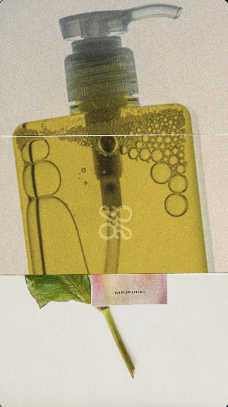
Oasis is a conceptual skincare brand built around clean beauty and the idea of making ordinary moments feel luxurious. This self-directed four-week project included developing the concept, brand identity, packaging, and styled product photography.

Product teaser video (left). Flat-lay shot featuring the gel moisturizer packaging (right).
A situation or place preserved from surrounding unpleasantness; a refuge.
"an oasis of serenity amid chaos."
"an oasis of serenity amid chaos."


Brand-forward teaser shots featuring logo details and visual identity.
Research into popular skincare brands showed they often use minimal layouts, ample white space, and clean sans-serif type. This common aesthetic created a clean, but somewhat clinical feel in the market. I saw the opportunity to give the brand a bit more warmth and visual depth.

I explored logo directions that balanced elegance with a warm, organic feel. The goal was to create a visual identity that felt thoughtful and inviting rather than clinical.
The final Oasis logo is a serif wordmark featuring a subtle ligature, accompanied by a complementary monogram for secondary brand applications.